Princeton University
Visual Arts Program
VIS 208, W-o-r-l-d-w-i-d-e-w-e-b
Mondays, 1:30–4:20 pm
Spring 2026
This course focuses on graphic design for the World Wide Web. Much of graphic design today happens online. Design provides a voice that can cut through the noise, but does so best when concretely aware of its context. The immediacy and speed of social media compared to the relative slowness of a website can make the World Wide Web feel like an anachronism. This might also be its strength. Students will learn to hand-code html, write css, and use basic javascript to develop personal websites which link together and form a collective web. Student design work is guided through class assignments, readings, and discussion. No particular experience in design or programming required.
Print syllabus / Download readings
February 2, 2026
Vague, but exciting . . .
https://princeton.zoom.us/j/98140026448?pwd=ZRjRgODHimRf47QaPKXXCZDUP9S36d.1
Zoom recording
Exercise
W-W-W-W-T-F?
Reading
Weaving the Web (Tim Berners-Lee)
Resources
Information Management: A Proposal (Tim Berners-Lee)
The first website (info.cern.ch)
Worldwideweb browser browser (emulator)
Line-mode browser (emulator)
Lynx browser (software)
Are.na w-o-r-l-d-w-i-d-e-w-e-b channel
For Everyone (video)
Tim Berners-Lee Invented the World Wide Web. Now He Wants to Save It (New Yorker)
Scribbled at the top of Information Management: A Proposal was tacit approval:
With that, physicist and computer programmer Tim Berners-Lee was free to pursue his vision of a new (what would be) global hypertext network connecting computers and people to each other in a dense and redundant network without which contemporary life seems almost impossible. But in 1990 it was only a simple, perhaps counterintuitive, scheme for connecting scientists and their documents to one another at the European Center for Particle Physics (CERN) on the outskirts of Geneva, Switzerland.
Berners-Lee arrived at CERN in 1980 and was surprised to discover that information about what computer was where, how to locate a specific software module, or who had done what with whom and when was hard to find. By 1989, his proposal for what to do about it described the situation:
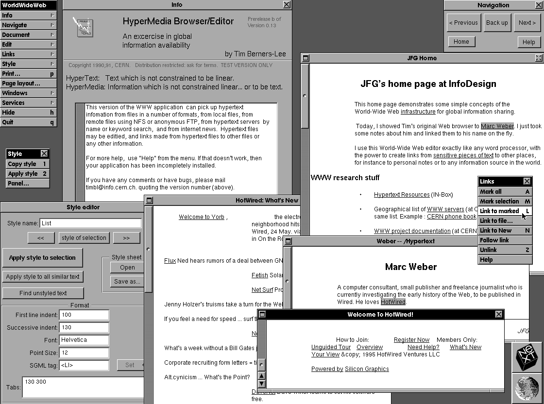
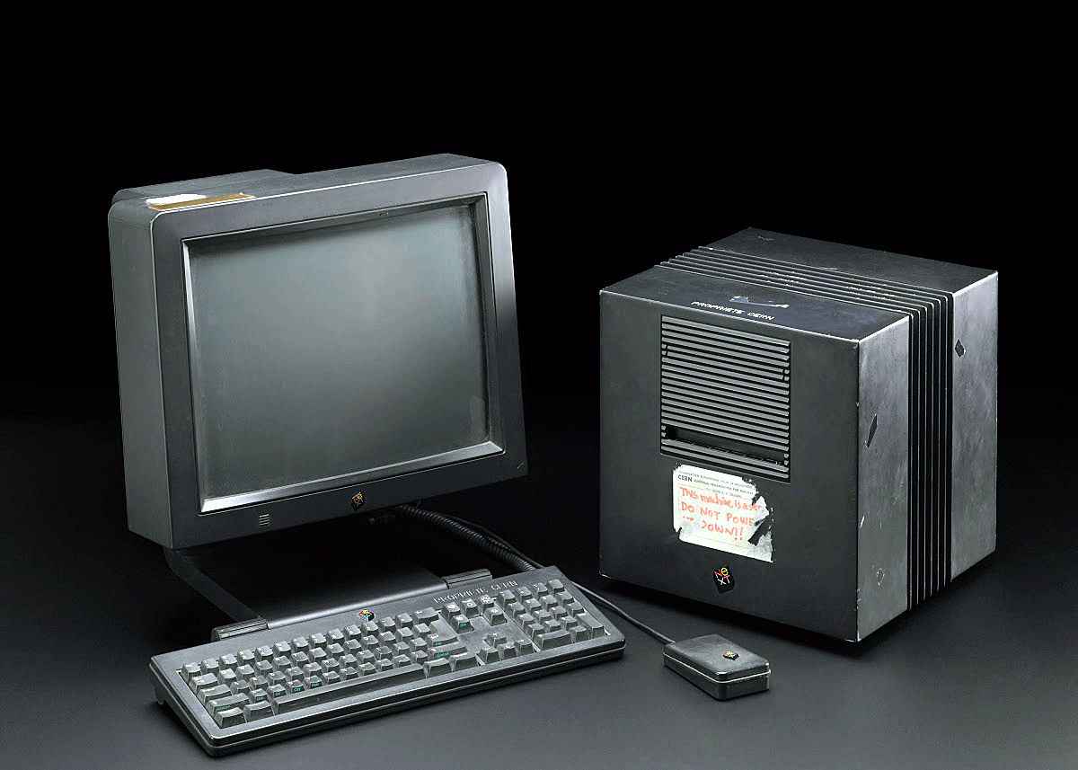
Berners-Lee imagined a network with “anything being potentially connected with anything.” When he received the green light in November 1990, he was already implementing a prototype hypertext reading and writing software he named WorldWideWeb. (He’d considered a couple of other acronyms including The Information Mine (TIM) and Mine Of Information (MOI) but rejected both as a bit narcissistic.) Here’s a screenshot of the software running on his NeXT Computer workstation (which was also the first web server on the Internet):
Today, you can run his WorldWideWeb software and surf the internet like it’s 1990 here in an emulator. But at the time WorldWideWeb ran only on Berners-Lee’s specific machine and the very limited number of similarly configured NeXT computers, so it wasn’t so useful. To make the web more accessible, a line-mode browser was developed at CERN by 1991 which ran in a text-only terminal, on most unix computers, and requiring very little power. (You can also test-drive this software in an emulator here which evolved into Lynx, a text-only browser that still works on contemporary machines.) The line-mode browser was a strict hypertext environment, with links identified by numbers in brackets like this [1]. It was fast and simple and started to realize Berners-Lee’s original intuition:
Continues in class ...
With that, physicist and computer programmer Tim Berners-Lee was free to pursue his vision of a new (what would be) global hypertext network connecting computers and people to each other in a dense and redundant network without which contemporary life seems almost impossible. But in 1990 it was only a simple, perhaps counterintuitive, scheme for connecting scientists and their documents to one another at the European Center for Particle Physics (CERN) on the outskirts of Geneva, Switzerland.
Berners-Lee arrived at CERN in 1980 and was surprised to discover that information about what computer was where, how to locate a specific software module, or who had done what with whom and when was hard to find. By 1989, his proposal for what to do about it described the situation:
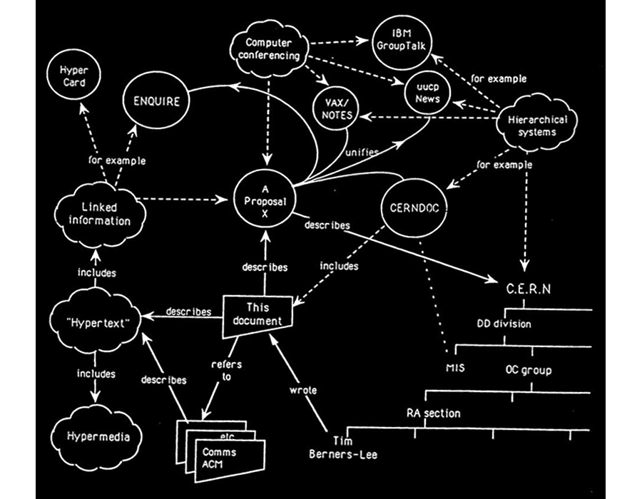
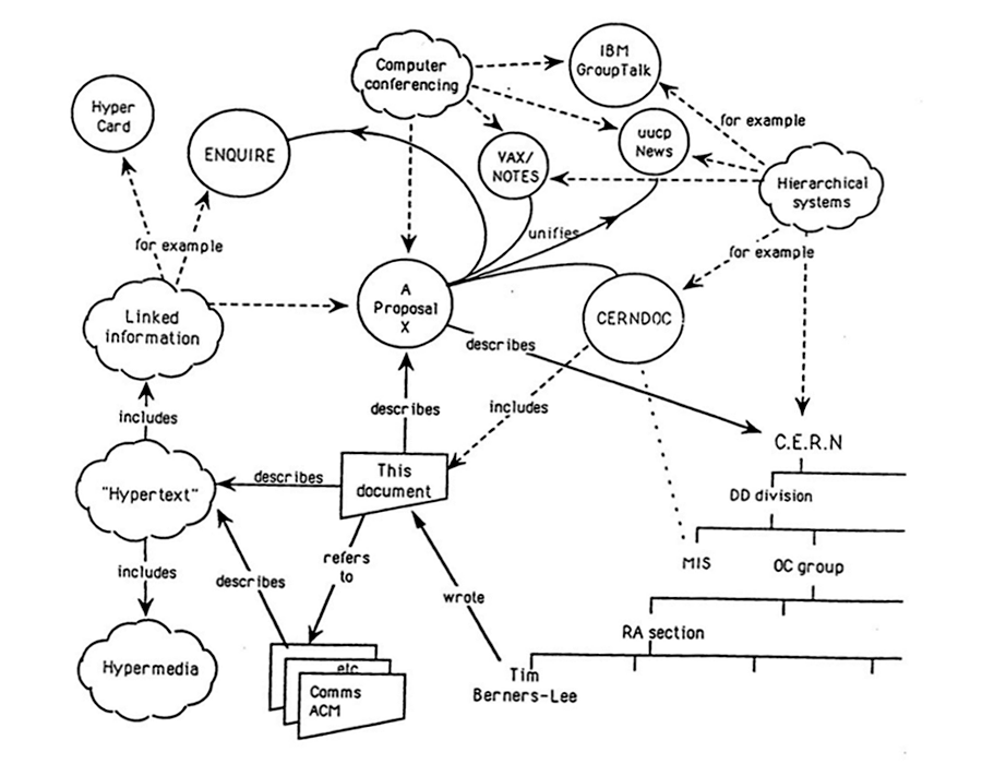
CERN is a wonderful organisation. It involves several thousand people, many of them very creative, all working toward common goals. Although they are nominally organised into a hierarchic management structure, this does not constrain the way people will communicate, and share information, equipment and software across groups. The actual observed working structure of the organisation ts a multiply connected “web” whose interconnections evolve with time.And he reasoned that if the actual organization was a densely connected web, then the information management system should mirror that structure. He included this diagram of mixed people, computers, and documents on the first page of his proposal to show what he meant.
Berners-Lee imagined a network with “anything being potentially connected with anything.” When he received the green light in November 1990, he was already implementing a prototype hypertext reading and writing software he named WorldWideWeb. (He’d considered a couple of other acronyms including The Information Mine (TIM) and Mine Of Information (MOI) but rejected both as a bit narcissistic.) Here’s a screenshot of the software running on his NeXT Computer workstation (which was also the first web server on the Internet):
Today, you can run his WorldWideWeb software and surf the internet like it’s 1990 here in an emulator. But at the time WorldWideWeb ran only on Berners-Lee’s specific machine and the very limited number of similarly configured NeXT computers, so it wasn’t so useful. To make the web more accessible, a line-mode browser was developed at CERN by 1991 which ran in a text-only terminal, on most unix computers, and requiring very little power. (You can also test-drive this software in an emulator here which evolved into Lynx, a text-only browser that still works on contemporary machines.) The line-mode browser was a strict hypertext environment, with links identified by numbers in brackets like this [1]. It was fast and simple and started to realize Berners-Lee’s original intuition:
Suppose all the information stored on computers everywhere were linked I thought. Suppose I could program my computer to create a space in which anything could be linked to anything. All the bits of information in every computer at CERN, and on the planet, would be available to me and to anyone else. There would be a single, global information space. Once a bit of information in that space was labeled with an address, I could tell my computer to get it. By being able to reference anything with equal ease, a computer could represent associations between things that might seem unrelated but somehow did, in fact, share a relationship. A web of information would form.Working from that software running on his local workstation and across a local network, Berners-Lee staged the first website on the internet and developed a set of digital protocols which remain the technical foundation of the World Wide Web today. These include HTML (Hypertext Markup Language), HTTP (Hypertext Transfer Protocol), and URL (Uniform Resource Locator). His imagined version of what would become an impossibly connected global web was remarkably complete. He described it years later in his technical memoir-of-sorts, Weaving the Web:
In an extreme view, the world can be seen as only connections, nothing else. We think of a dictionary as the repository of meaning, but it defines words only in terms of other words. I liked the idea that a piece of information is really defined only by what it’s related to, and how it’s related. There really is little else to meaning. The structure is everything. There are billions of neurons in our brains, but what are neurons? Just cells. The brain has no knowledge until connections are made between neurons. All that we know, all that we are, comes from the way our neurons are connected.
Continues in class ...
February 9, 2026
The NeXT computer
Reading
The NeXT logo (Paul Rand)
Intuition and Ideas (Paul Rand)
Resources
W3 Schools HTML Tutorial
The NeXT Computer introduction
International NeXT Forum
Paul Rand Introducing the NeXT identity
NeXT on Are.na
Steve Jobs on the World Wide Web
Assignment
#1 <a> starts
The NeXT computer
Reading
The NeXT logo (Paul Rand)
Intuition and Ideas (Paul Rand)
Resources
W3 Schools HTML Tutorial
The NeXT Computer introduction
International NeXT Forum
Paul Rand Introducing the NeXT identity
NeXT on Are.na
Steve Jobs on the World Wide Web
Assignment
#1 <a> starts
Tim Berners-Lee (from class 1) wrote his WorldWideWeb program on a brand-new (well, in 1990 anyway) high-end workstation from NeXT Computer. Here’s a picture:
NeXT Computer, Inc. was founded five years earlier by Steve Jobs after being fired from his first company, Apple Computer by its board of directors. Jobs had a new idea that personal computers would go only so far, and he was interested in entering other markets with more powerful hardware. He wanted to make workstation computers, then priced out of reach of all but the largest organizations at $20–50,000. The NeXT machine cost only $6,500 for a base model and was marketed to universities, which would make the powerful computers and software applications accessible to students and faculty.
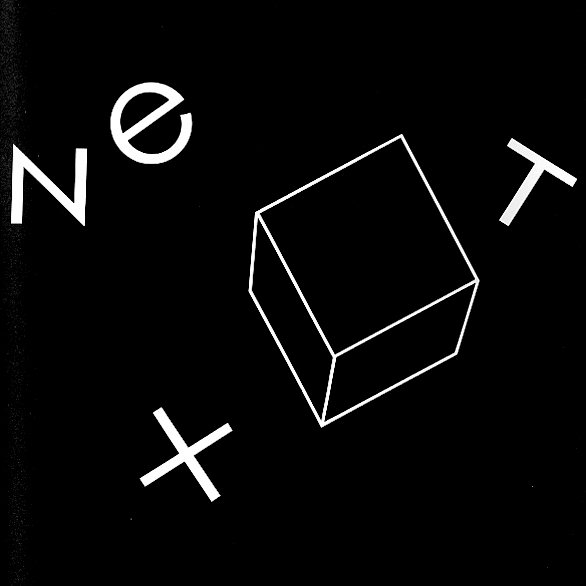
Jobs brought a team with him from Apple, including graphic designer Susan Kare. As before, Kare was responsible for all of the interface graphics in the new computer’s operating system software. Kare then suggested Paul Rand to work on a logo for the new company. Jobs had long admired Rand’s work and he invited him to work on the project. Rand agreed enthusiastically — he liked Jobs and the new machines were modern, black, austere; one was simply a cube. This is the logo he designed:

By 1985 Paul Rand was living and working outside of New Haven, Connecticut. He was teaching at Yale University School of Art and was in great demand as a designer of corporate logos; these projects have large budgets and high stakes, and Rand knew it. When handling proposed new commissions, Rand would invite the potential commissioner to meet at the International House of Pancakes near his studio, have breakfast, and discuss their problem on neutral ground. Rand would then decide whether or not to accept the job. His baseline fee was $100,000.
When proposing a new logo, Rand typically produced a small printed booklet which collected his design research, exploration, and finally, a single recommendation. These were really proto-slide decks, and provide a clear look into the graphic design research and process, as well as a hopefully irrefutable argument to his clients for the proposed logo. The booklet provides a peek behind the curtain.
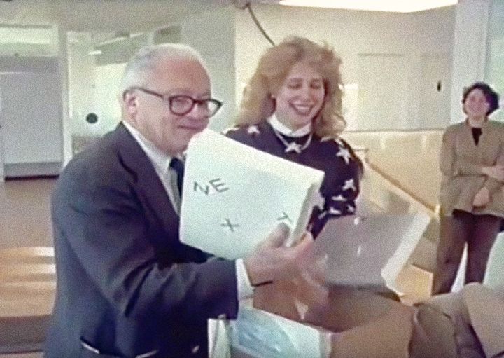
Rand’s visit to NeXT Computer to present his logo proposal was, miraculously, captured on video. In the part I’d like to share the full staff is assembled to see what Rand’s come up with. Here Rand is assisted by Kare as he pulls the booklets out of a box.
NeXT Computer, Inc. was founded five years earlier by Steve Jobs after being fired from his first company, Apple Computer by its board of directors. Jobs had a new idea that personal computers would go only so far, and he was interested in entering other markets with more powerful hardware. He wanted to make workstation computers, then priced out of reach of all but the largest organizations at $20–50,000. The NeXT machine cost only $6,500 for a base model and was marketed to universities, which would make the powerful computers and software applications accessible to students and faculty.
Jobs brought a team with him from Apple, including graphic designer Susan Kare. As before, Kare was responsible for all of the interface graphics in the new computer’s operating system software. Kare then suggested Paul Rand to work on a logo for the new company. Jobs had long admired Rand’s work and he invited him to work on the project. Rand agreed enthusiastically — he liked Jobs and the new machines were modern, black, austere; one was simply a cube. This is the logo he designed:
By 1985 Paul Rand was living and working outside of New Haven, Connecticut. He was teaching at Yale University School of Art and was in great demand as a designer of corporate logos; these projects have large budgets and high stakes, and Rand knew it. When handling proposed new commissions, Rand would invite the potential commissioner to meet at the International House of Pancakes near his studio, have breakfast, and discuss their problem on neutral ground. Rand would then decide whether or not to accept the job. His baseline fee was $100,000.
When proposing a new logo, Rand typically produced a small printed booklet which collected his design research, exploration, and finally, a single recommendation. These were really proto-slide decks, and provide a clear look into the graphic design research and process, as well as a hopefully irrefutable argument to his clients for the proposed logo. The booklet provides a peek behind the curtain.
Rand’s visit to NeXT Computer to present his logo proposal was, miraculously, captured on video. In the part I’d like to share the full staff is assembled to see what Rand’s come up with. Here Rand is assisted by Kare as he pulls the booklets out of a box.
Narrator: This morning at its offices in Silicon Valley, California, the company is about to get a first look at its new trademark, the signature it hopes to make familiar around the world. The designer Paul Rand created the logos for IBM, Westinghouse, UPS, and many others. Rand doesn’t normally work for infant companies even if they could afford him. But NeXT isn’t an ordinary startup.
Paul Rand: The idea—please don’t open, don’t look at the back first. This is the front. And don’t get scared, this is not the design. I did this to sort of floor Steve when he saw it, you know and say, “Good Jesus, a hundred thousand bucks down the drain.” ...Continues in class ...
February 16, 2026
The Art of Human-Computer Interface Design
Reading
The Art of Human-Computer Interface Design (Brenda Laurel, ed)
Resources
Apple Advanced Technology Group
The legendary Apple research group that shaped our world
HyperCard, the missing link to the Web
1986-12-Human-Interface-Guidelines-(Final-Draft)
Assignment
#1 <a> (continues)
Published in 1990, The Art of Human-Computer Interface Design became a bit of a Bible for a discipline trying to define itself.
But it didn’t start out that way. Apple Human Interface Group manager Joy Mountford writes in the book’s introduction:
There were already pockets where the two approaches were being synthesized. One was Apple’s Advanced Technology Group, a collection of free-thinking engineers and designers exploring new software projects whose scope and/or timeframe were outside of more commercially-driven parts of Apple. It was a center for research, inspiring and inspirational. Reporting on it twenty years later, Fast Company called ATG “legendary.”

Probably true enough if you look around at the software it produced over its 11-year lifespan from 1986 – 1997. A partial list includes QuickDraw, QuickTime, QuickTime VR, ColorSync, AppleScript, PlainTalk speech recognition, Speech Synthesis, Apple Data Detectors, and HyperCard.
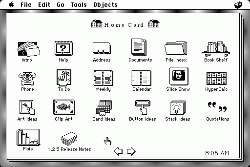
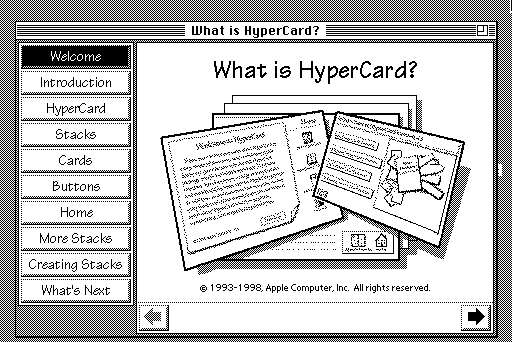
HyperCard, organized around the metaphor of a stack of linked cards, allowed non-programmers to assemble interactive softwares that would run on Apple Macintosh. Any individual card could contain text, images (even rudimentary audio and video) plus any number of buttons or hyperlinks which connected one card to another card in the stack. HyperCard found a rabid audience for its hypertextural logic and inspired Tim Berners-Lee (from class 1) and his WorldWideWeb. (Fun fact: Apple programmer Bill Atkinson was inspired himself originally to make HyperCard following an LSD trip.)
For The Art of Human-Computer Interface Design, Advanced Technology Group member Laurie Vertelney posed a time-constrained interface design exercise to both a computer programmer, Henry Lieberman from MIT Visible Language Workshop, and to an Apple interface designer, Michael Arent. The two approaches are rather different. We will have a look.
Continues in class ...
But it didn’t start out that way. Apple Human Interface Group manager Joy Mountford writes in the book’s introduction:
The initial idea was to collect some of the distributed expertise and wisdom about interfaces inside Apple into a book that could be used to train current and future Apple employees.Interface design was still brand new and handled by either computer programmers (concerned mostly with functionality) or graphic designers (focused on communication and consistency). Even within Apple, there were committed positions on either side. Editor Brenda Laurel described the situation: “The noun, interface, is taken to be a discrete and tangible thing that we can map, draw, design, implement, and attach to an existing bundle of functions.” She goes on to describe that the book was meant to “explode that notion and replace it with one that can guide our work in the right direction.”
There were already pockets where the two approaches were being synthesized. One was Apple’s Advanced Technology Group, a collection of free-thinking engineers and designers exploring new software projects whose scope and/or timeframe were outside of more commercially-driven parts of Apple. It was a center for research, inspiring and inspirational. Reporting on it twenty years later, Fast Company called ATG “legendary.”
Probably true enough if you look around at the software it produced over its 11-year lifespan from 1986 – 1997. A partial list includes QuickDraw, QuickTime, QuickTime VR, ColorSync, AppleScript, PlainTalk speech recognition, Speech Synthesis, Apple Data Detectors, and HyperCard.
HyperCard, organized around the metaphor of a stack of linked cards, allowed non-programmers to assemble interactive softwares that would run on Apple Macintosh. Any individual card could contain text, images (even rudimentary audio and video) plus any number of buttons or hyperlinks which connected one card to another card in the stack. HyperCard found a rabid audience for its hypertextural logic and inspired Tim Berners-Lee (from class 1) and his WorldWideWeb. (Fun fact: Apple programmer Bill Atkinson was inspired himself originally to make HyperCard following an LSD trip.)
For The Art of Human-Computer Interface Design, Advanced Technology Group member Laurie Vertelney posed a time-constrained interface design exercise to both a computer programmer, Henry Lieberman from MIT Visible Language Workshop, and to an Apple interface designer, Michael Arent. The two approaches are rather different. We will have a look.
Continues in class ...
February 23, 2026
You Will
https://princeton.zoom.us/j/98140026448?pwd=ZRjRgODHimRf47QaPKXXCZDUP9S36d.1
Reading
Speculative Everything (Anthony Dunne, Fiona Raby)
Resources
W3 Schools CSS Tutorial
You Will on Youtube
History Of The Online Banner Ad
Welcome to The "First" Banner Ad
Assignment
#1 <a> (ends)
#2 <img> (starts)
When looking at interfaces I find it particularly useful to look at things that are out of date, that don’t clearly register in the current moment. It’s even better if these are from long enough ago that we’ve forgotten what screens looked like then. Interface design and graphic conventions both change and also cohere incredibly fast, so this isn’t hard.
Interface design is an explicitly speculative exercise, and so when looking at interfaces from the past we see what the present was supposed to look like. Sometimes these match our current situation, but often they don’t. In either case, the speculative interface design scenarios reveal desires for how we’d like our computers to behave. The fictions suggest uses we may have never known we wanted, but by articulating these as rendered design proposals, they often end up directly forming the interfaces we end up with.
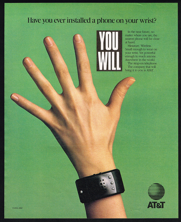
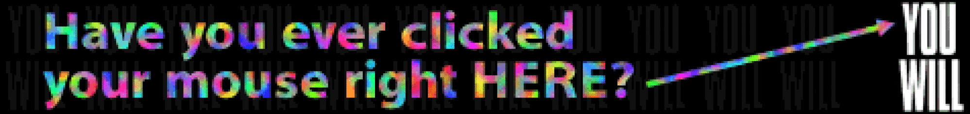
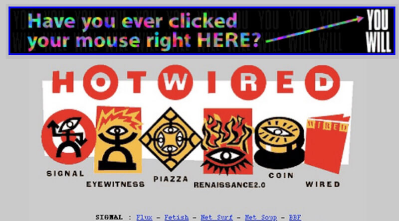
I’d like to look at a few of these interface design scenarios from a print and television campaign run by AT&T in 1993 called “You Will.”
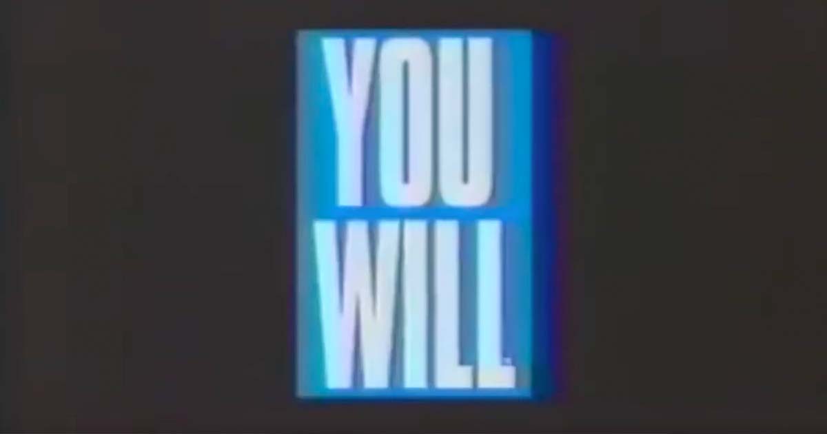
The ads describe and render a collection of interfaces coming sometime in the near future. At the time, these looked impossibly futuristic, but now, more than 20 years later, many, even most, are intimately familiar. These ads were directed by David Fincher (not yet famous) with voiceovers by TV’s Tom Selleck (already very famous).
Here’s a print ad which feels like old news.
The campaign even reached the World Wide Web, which was then not even three years old. It was one of 12 rotating banners on the popular website Hotwired where it is credited as the web’s first banner ad (with an astonishing 44% click-through rate).
Continues in class ...
Interface design is an explicitly speculative exercise, and so when looking at interfaces from the past we see what the present was supposed to look like. Sometimes these match our current situation, but often they don’t. In either case, the speculative interface design scenarios reveal desires for how we’d like our computers to behave. The fictions suggest uses we may have never known we wanted, but by articulating these as rendered design proposals, they often end up directly forming the interfaces we end up with.
I’d like to look at a few of these interface design scenarios from a print and television campaign run by AT&T in 1993 called “You Will.”
The ads describe and render a collection of interfaces coming sometime in the near future. At the time, these looked impossibly futuristic, but now, more than 20 years later, many, even most, are intimately familiar. These ads were directed by David Fincher (not yet famous) with voiceovers by TV’s Tom Selleck (already very famous).
AT&T Ad 1: Have you ever borrowed a book from thousands of miles away? Crossed the country without stopping for directions? Or sent someone a fax from the beach? You will. And the company that will bring it to you, AT&T.
AT&T Ad 2: Have you ever paid a toll without slowing down? Bought concert tickets from cash machines? Or tucked your baby in from a phone booth? You will. And the company that’ll bring it to you, AT&T.
AT&T Ad 3: Have you ever opened doors with the sound of your voice? Carried your medical history in your wallet? Or attended a meeting in your bare feet? You will, and the company that will bring it to you, AT&T.
AT&T Ad 4: Have you ever watched the movie you wanted to the minute you wanted to? Learned special things from faraway places? Or tucked your baby in from a phone booth? You will, and the company that will bring it to you, AT&T.What strikes me in watching these is that when working in interface design, the most consequential work doesn’t have a template — there’s no existing model. There are incremental advances in interface design perpetually put forward, like a better button design or a smoother loading widget, but these are driven more by a previous product than a comprehensive reimagination. The incremental designs respond to an existing interaction, rather than asking the more fundamental question of what the interaction could be. An interface can be radically reconceived, even just its visual vocabulary can suggest a completely different use.
Here’s a print ad which feels like old news.
The campaign even reached the World Wide Web, which was then not even three years old. It was one of 12 rotating banners on the popular website Hotwired where it is credited as the web’s first banner ad (with an astonishing 44% click-through rate).
Continues in class ...
March 2, 2026
What language shall we speak?
Reading
W3 Schools CSS Tutorial
Resources
The Design of Everyday Things (Donald Norman)
Sylvia Harris: 2014 AIGA Medalist
Brooklyn Independent Television
On Sylvia Harris (David Gibson)
Remembering Sylvia Harris (Jessica Helfand)
User-centered Design
User Centered Design (UCD)
Assignment
#2 <img> (continues)
Sylvia Harris flipped design around the other way. Instead of thinking from the point-of-view of the designer, she considered every project from the perspective of its user. Now, this was anything but standard practice at the time. Today “user-centered design” is ubiquitous, but this wasn't today — it was 1993 (just about the time of those AT&T ads from last class), and I was lucky enough to be there.
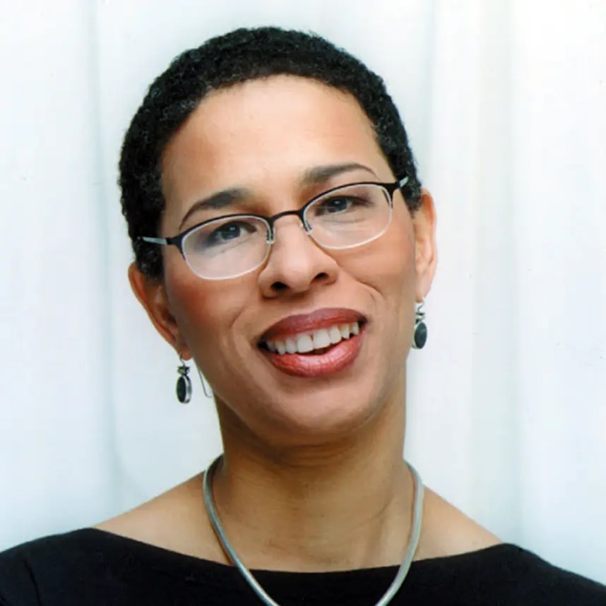
I was fresh out of school and working at Two Twelve Associates, a graphic design firm in New York specializing in “Public Information Design” that Sylvia had co-founded with two Yale School of Art classmates, David Gibson and Juanita Dugdale. Two Twelve was a wonderful setting for a young designer, and I was able to not only work on projects but also observe the projects going on around me. One of these was the project to design the first touchscreen interface for Citibank ATMs. Sylvia led the effort, which started with research.
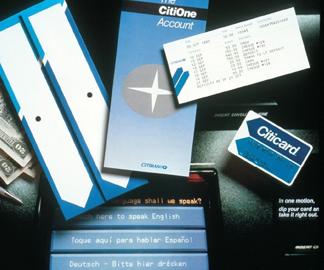
Existing ATM interfaces used the second-person imperative address of machines, with sequential screens of impersonal instructions telling the user what to do next. In distinct contrast, this interface spoke in the first-person, addressing the user directly. For example, it asks (in this polyglot metropolis),
The 2000 U.S. Census looked considerably different from the 1990 version. Like the ATM interface, these begin with a plea to the user, “Your answers are important!” And indeed they were as political power depends on an accurate count of citizens. The stakes could hardly be higher.
Continues in class . . .
I was fresh out of school and working at Two Twelve Associates, a graphic design firm in New York specializing in “Public Information Design” that Sylvia had co-founded with two Yale School of Art classmates, David Gibson and Juanita Dugdale. Two Twelve was a wonderful setting for a young designer, and I was able to not only work on projects but also observe the projects going on around me. One of these was the project to design the first touchscreen interface for Citibank ATMs. Sylvia led the effort, which started with research.
Existing ATM interfaces used the second-person imperative address of machines, with sequential screens of impersonal instructions telling the user what to do next. In distinct contrast, this interface spoke in the first-person, addressing the user directly. For example, it asks (in this polyglot metropolis),
What language shall we speak?The “we” here is important — this was generous design, a design that considered its user directly, as a partner rather than an operator. It was inclusive. And it was completely different from other bank machines at the time. It was an exceptional project, completed at a very high level for a very wide audience. Sylvia recalled:
My firm got a series of contracts with Citibank to work on the design of the first ATM. I learned everything I know about user testing, product design and strategic planning from that experience. It was like going to graduate school in usability and I made contacts that have lasted to this day.Several years later, she was hired by the United States Census Bureau to bring this user-centered approach to the redesign of the U.S. Census 2000 forms. Sylvia was charged with making the forms easier to use, more legible, and in the process to collect a wider demographic population of responses from the 80 million forms sent out every ten years. As with most of her projects, she started with research. In this case that research started in a classroom at Yale School of Art, where she had introduced an information design class. Together with her MFA students, she developed the redesign of the census form. The results were powerful.
The 2000 U.S. Census looked considerably different from the 1990 version. Like the ATM interface, these begin with a plea to the user, “Your answers are important!” And indeed they were as political power depends on an accurate count of citizens. The stakes could hardly be higher.
Continues in class . . .
March 16, 2026
Netscape Navigator 0.9b
Reading
W3 Schools Javascript Tutorial
my website is a shifting house next to a river of knowledge. what could yours be? (Laurel Schwulst)
Resources
Reuters NewsMachine
Reuters Corporate
Netscape Navigator 0.9b (emulator)
The Interface Experience
The Browser Wars
Tales from the Browser Wars
The Birth of Javascript
Assignment
#2 <img> (ends)
#3 w-w-w (starts)
Visitor
Laurel Schwulst (via Landline (kinda))
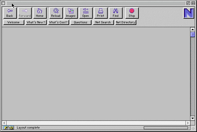
Netscape Navigator 0.9b was released June 13, 1994. It was the first widely-used web browser, growing out of NCSA Mosaic, an earlier software which could combine both text *and* images on the same webpage. And yet Netscape 0.9b (b is for beta) was not even version 1.0 — this pre-release was a sign of the hyperspeed of browser software development. You can test-drive an emulator here.
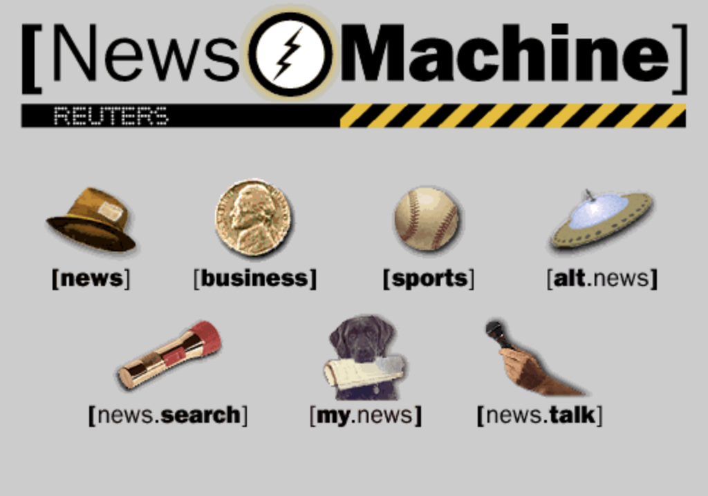
I remember Netscape 0.9b well. I was working for Two Twelve Associates in New York (see Sylvia Harris from last class) as a young, rather green junior designer. Two Twelve had worked on a series of early screen-based projects when Reuters approached with a new project. Founded in 1851 and based in London, Reuters was one of the world’s largest news providers. By 1994, Reuters was ready to reach a new audience through a consumer-facing website they called the Reuters News Machine. Being eager, and technically-minded, I convinced the studio that I could do this project. I found a contract programmer, Stuart Constantine of the early design blog CORE77, to produce a small, static website to deliver real-time news stories. Here is what the homepage looked like, all 150k of it:
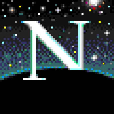
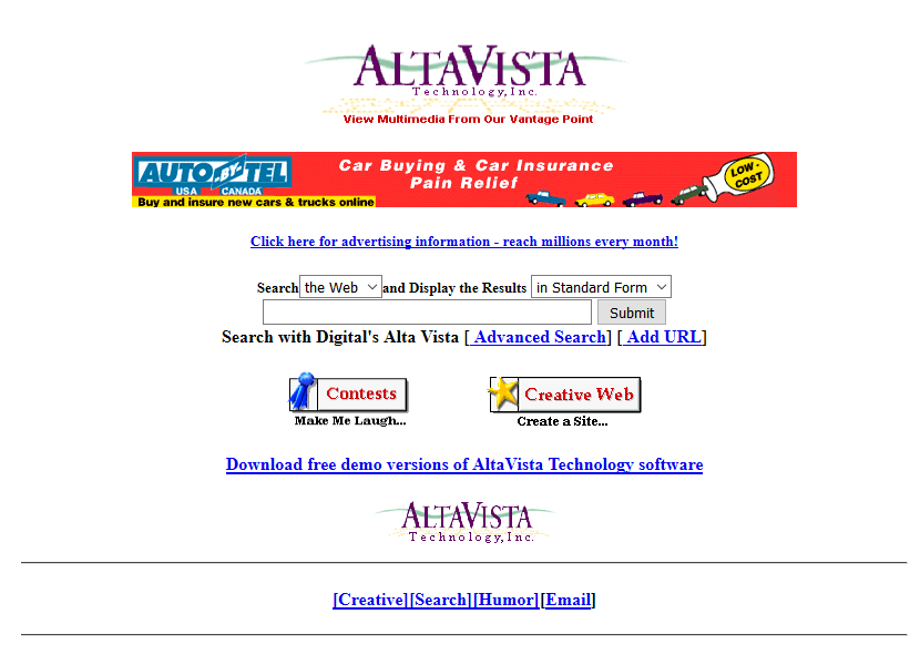
This was all brand new. News on the web really didn’t exist yet. Internet directories like Yahoo which pointed to other websites as a list organized by topic. Primitive search had just arrived with Altavista. The New York Times first website appeared two years later. With its multi-media browser and the flood of new, content-rich websites, Netscape absolutely took off. It quickly become the dominant web browser with 75% market share after four months while releasing update after update, adding an email reader, page composer, even its own browser scripting language, Javascript.
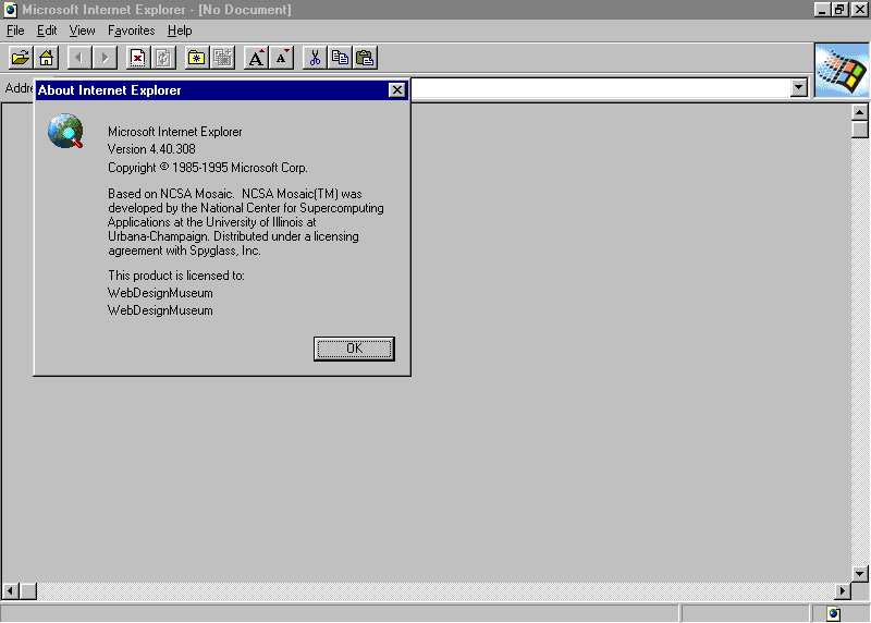
By late 1995 and realizing they were missing the wave, Microsoft quickly licensed Mosaic’s software and released their own browser, Internet Explorer. IE v1.0 was an inferior product, but it was also free for all users while Netscape was free for individuals but not for companies. Microsoft *poured* money into its new product and Internet Explorer rapidly improved. By 1997, a much-improved v4.0 was released in San Francisco with a 10-ft tall “e” logo. That night, Microsoft employees hired a moving crew to drive the logo down to Mountain View and quietly install it on Netscape’s front lawn. Netscape employees witnessed the maneuver and countered by knocking it to the ground and installing their own mascot on top.
The Browser Wars were on, as Microsoft and Netscape aggressively competed for users with updates and custom features. At the time, Microsoft Windows had a near monopoly on operating system software for personal computers (around 95%). Microsoft bundled IE with Windows as its default browser, tightly integrating the browser into the operating system and, as a result, users often did not even realize they had a choice. (Microsoft was later sued for this anti-competitive behavior.) Microsoft was trying to ”cut off Netscape’s air supply.” It worked. By 1999 Microsoft owned 99% of the browser market.
Realizing that a browser monopoly web was not in the best interest of users or the web, Netscape open-sourced its code, established a non-profit (Mozilla Foundation), and launched what would become the Firefox browser in 2002.

The wars were over, for now.
Continues in class ...
I remember Netscape 0.9b well. I was working for Two Twelve Associates in New York (see Sylvia Harris from last class) as a young, rather green junior designer. Two Twelve had worked on a series of early screen-based projects when Reuters approached with a new project. Founded in 1851 and based in London, Reuters was one of the world’s largest news providers. By 1994, Reuters was ready to reach a new audience through a consumer-facing website they called the Reuters News Machine. Being eager, and technically-minded, I convinced the studio that I could do this project. I found a contract programmer, Stuart Constantine of the early design blog CORE77, to produce a small, static website to deliver real-time news stories. Here is what the homepage looked like, all 150k of it:
This was all brand new. News on the web really didn’t exist yet. Internet directories like Yahoo which pointed to other websites as a list organized by topic. Primitive search had just arrived with Altavista. The New York Times first website appeared two years later. With its multi-media browser and the flood of new, content-rich websites, Netscape absolutely took off. It quickly become the dominant web browser with 75% market share after four months while releasing update after update, adding an email reader, page composer, even its own browser scripting language, Javascript.
By late 1995 and realizing they were missing the wave, Microsoft quickly licensed Mosaic’s software and released their own browser, Internet Explorer. IE v1.0 was an inferior product, but it was also free for all users while Netscape was free for individuals but not for companies. Microsoft *poured* money into its new product and Internet Explorer rapidly improved. By 1997, a much-improved v4.0 was released in San Francisco with a 10-ft tall “e” logo. That night, Microsoft employees hired a moving crew to drive the logo down to Mountain View and quietly install it on Netscape’s front lawn. Netscape employees witnessed the maneuver and countered by knocking it to the ground and installing their own mascot on top.
The Browser Wars were on, as Microsoft and Netscape aggressively competed for users with updates and custom features. At the time, Microsoft Windows had a near monopoly on operating system software for personal computers (around 95%). Microsoft bundled IE with Windows as its default browser, tightly integrating the browser into the operating system and, as a result, users often did not even realize they had a choice. (Microsoft was later sued for this anti-competitive behavior.) Microsoft was trying to ”cut off Netscape’s air supply.” It worked. By 1999 Microsoft owned 99% of the browser market.
Realizing that a browser monopoly web was not in the best interest of users or the web, Netscape open-sourced its code, established a non-profit (Mozilla Foundation), and launched what would become the Firefox browser in 2002.
The wars were over, for now.
Continues in class ...
March 23, 2026
Touch start to begin
Reading
my website is a shifting house next to a river of knowledge. what could yours be? (Laurel Schwulst)
Resources
W3 Schools Javascript Tutorial
The-Interface-Experience.pdf (Kimon Keramidas)
Antenna Design
The Interface Experience
Talk to Me, MoMA
Art That Begs to be Touched (New York Times)
Assignment
#3 w-w-w (continues)
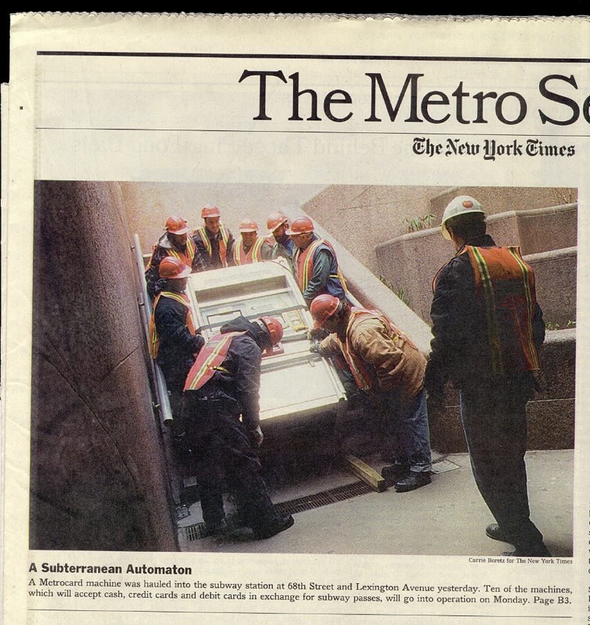
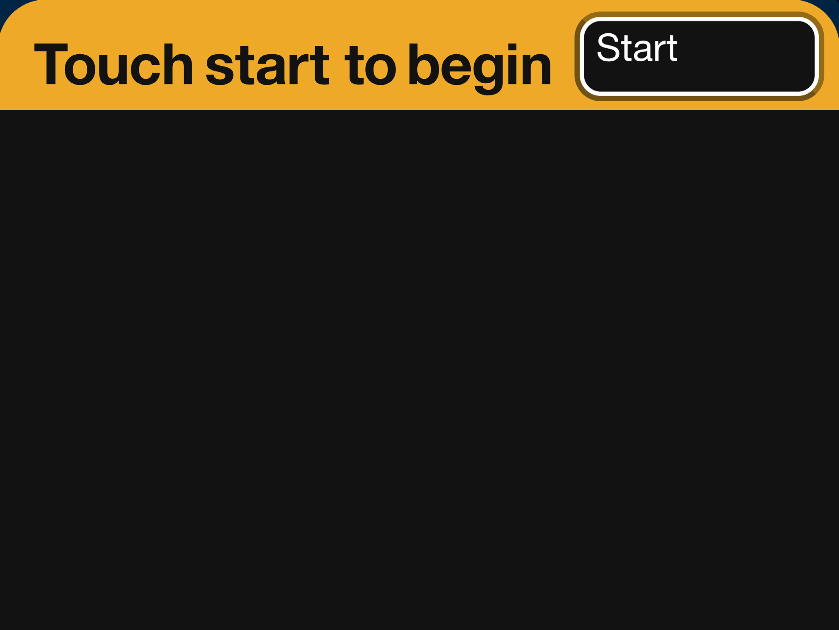
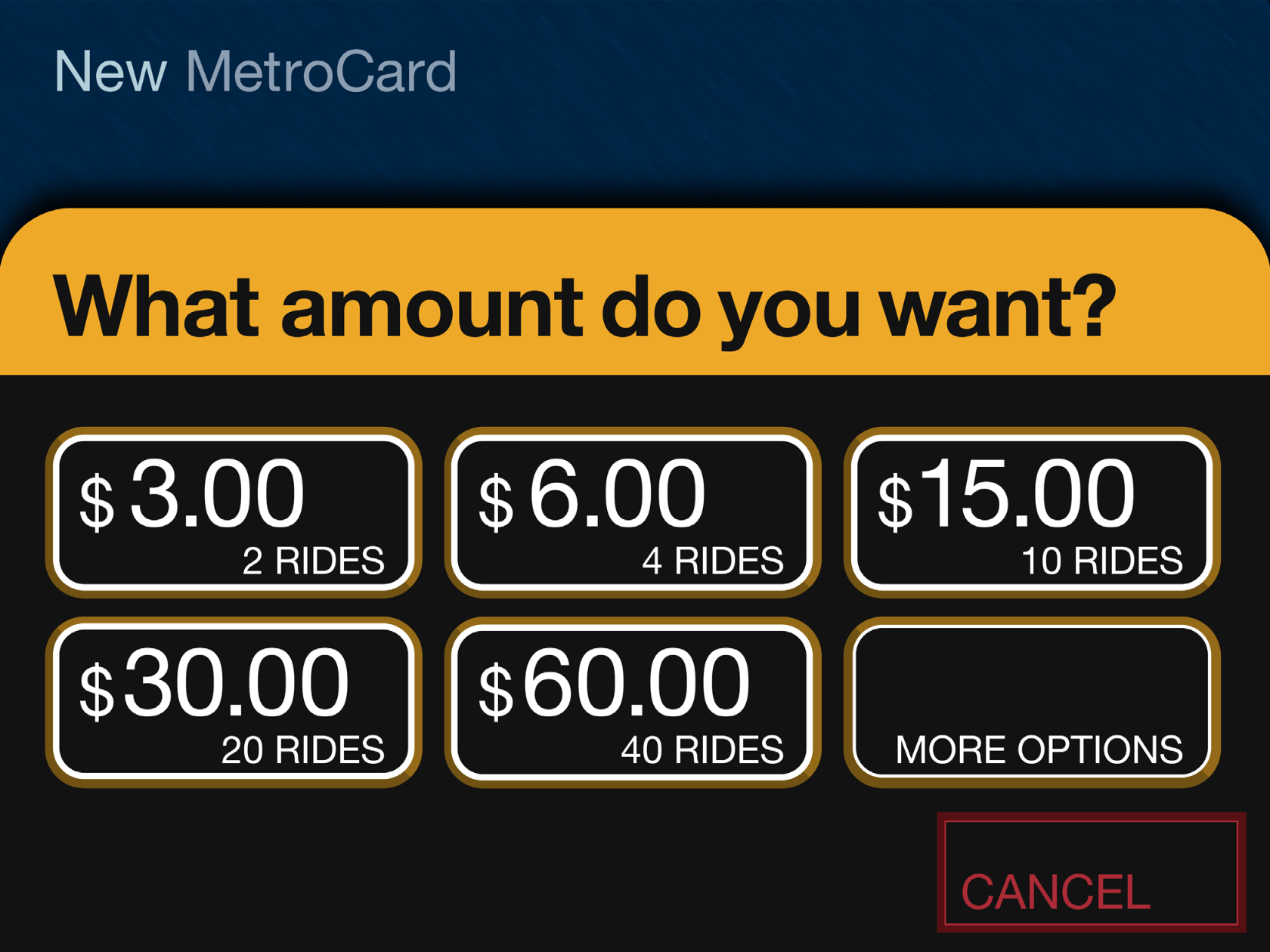
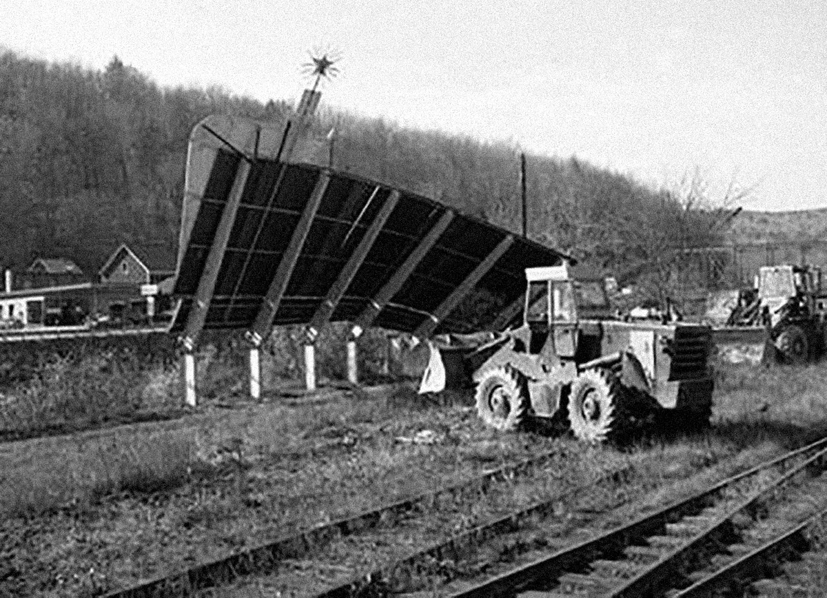
The first Metrocard Vending Machines were installed in New York City subway stations in January, 1999. Here’s one being shoehorned into 68th Street station, Manhattan:
Tomorrow, December 31, 2025, the last machine will have been removed and replaced with an all-new OMNY tap system. Over the 25+ years of service to billions of users, the graphic touchscreen interface has remained fundamentally unchanged from what I designed in 1997. That is a virtual eternity in the world of software.
This is a case study of that interface designed almost 30 years ago and was still in use today, fundamentally unchanged. This is a project I worked on, so it will have some personal detail.
We begin in 1995. I had just started working at IDEO San Francisco for Bill Moggridge. IDEO was a product design firm, but around that time they’d moved into the new practice of interaction design. I’d worked for a couple years in New York, and had heard about what was going on at IDEO. It sounded exciting and I managed to get a job there as an interaction designer. I moved to California. (Turns out, I was hired by Gitta Solomon who had come to IDEO from Apple Advanced Technology Group which we looked at in a previous class.)
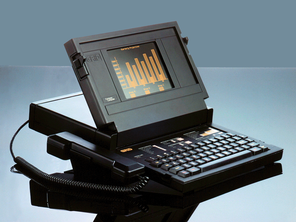
Twelve years before in 1983, Moggridge designed this laptop computer, the Grid Compass. Laptops were novel and, as I understand it, when Moggridge began to live with the machine he soon realized that the bulk of his attention was focused on the screen. The physical design of the product was good, but the interface was where the action was. This epiphany at least in part led to developing interaction design at IDEO. By 1995, when I arrived, the discipline was established, if fairly new.
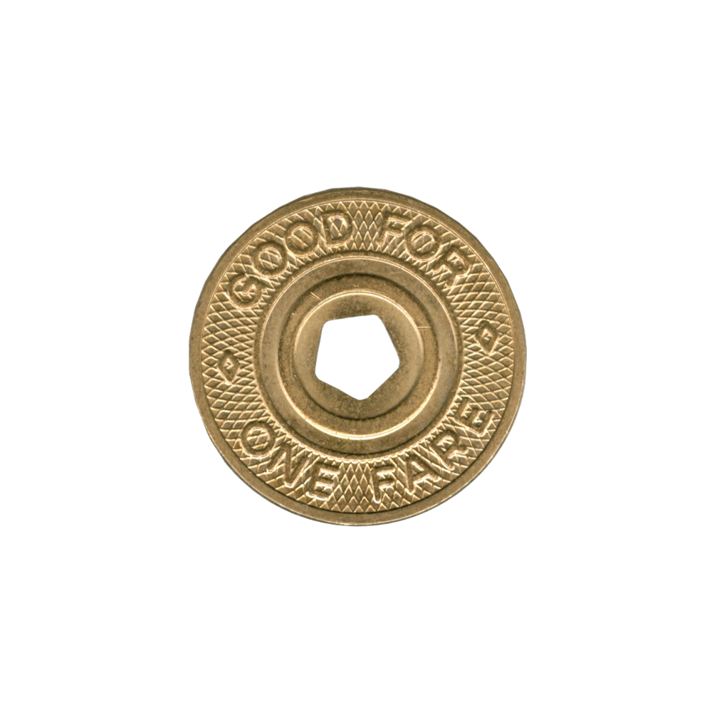
This is a New York City subway token, also from 1995. The token came from a clerk in a subway station where you walked up to the booth, stuffed your dollar under the window, and said, “One.” A token was returned and that token then put into a slot in a turnstile, which let you enter the subway. It was fast, could be a bit gruff, but it was also quite efficient.
At the time, the MTA (Metropolitan Transit Authority) was moving away from tokens and would soon introduce the MetroCard, a magnetic swipe stored value system, for fare payment. The MetroCard uses card readers built into turnstiles to validate transactions. Although you could also buy your MetroCard from the token booth, the MTA would soon offer an electronic vending machine for purchasing a MetroCard via a touchscreen interface. The new machine would eventually make the token booth redundant. There’d still be a clerk there to manage questions and problems and hand out maps, but most of the cards were meant to be sold through the machine. The MTA had been working on this project for a while already, but the machine was delayed. The job was commissioned to Cubic Westinghouse, a defense and public transportation contractor based in San Diego who was already building turnstiles and station furniture for the MTA. You might imagine that Cubic Westinghouse didn’t have a great deal of experience, or design nuance anyway, for the electronic, user-facing aspects of this new machine which facilitates a rather complicated transaction.
Design for screens was also still relatively crude and computer interfaces were not ubiquitous in the way they are now. To get an idea of that context, Google was not even a thing.
Continues in class ...
Tomorrow, December 31, 2025, the last machine will have been removed and replaced with an all-new OMNY tap system. Over the 25+ years of service to billions of users, the graphic touchscreen interface has remained fundamentally unchanged from what I designed in 1997. That is a virtual eternity in the world of software.
This is a case study of that interface designed almost 30 years ago and was still in use today, fundamentally unchanged. This is a project I worked on, so it will have some personal detail.
We begin in 1995. I had just started working at IDEO San Francisco for Bill Moggridge. IDEO was a product design firm, but around that time they’d moved into the new practice of interaction design. I’d worked for a couple years in New York, and had heard about what was going on at IDEO. It sounded exciting and I managed to get a job there as an interaction designer. I moved to California. (Turns out, I was hired by Gitta Solomon who had come to IDEO from Apple Advanced Technology Group which we looked at in a previous class.)
Twelve years before in 1983, Moggridge designed this laptop computer, the Grid Compass. Laptops were novel and, as I understand it, when Moggridge began to live with the machine he soon realized that the bulk of his attention was focused on the screen. The physical design of the product was good, but the interface was where the action was. This epiphany at least in part led to developing interaction design at IDEO. By 1995, when I arrived, the discipline was established, if fairly new.
This is a New York City subway token, also from 1995. The token came from a clerk in a subway station where you walked up to the booth, stuffed your dollar under the window, and said, “One.” A token was returned and that token then put into a slot in a turnstile, which let you enter the subway. It was fast, could be a bit gruff, but it was also quite efficient.
At the time, the MTA (Metropolitan Transit Authority) was moving away from tokens and would soon introduce the MetroCard, a magnetic swipe stored value system, for fare payment. The MetroCard uses card readers built into turnstiles to validate transactions. Although you could also buy your MetroCard from the token booth, the MTA would soon offer an electronic vending machine for purchasing a MetroCard via a touchscreen interface. The new machine would eventually make the token booth redundant. There’d still be a clerk there to manage questions and problems and hand out maps, but most of the cards were meant to be sold through the machine. The MTA had been working on this project for a while already, but the machine was delayed. The job was commissioned to Cubic Westinghouse, a defense and public transportation contractor based in San Diego who was already building turnstiles and station furniture for the MTA. You might imagine that Cubic Westinghouse didn’t have a great deal of experience, or design nuance anyway, for the electronic, user-facing aspects of this new machine which facilitates a rather complicated transaction.
Design for screens was also still relatively crude and computer interfaces were not ubiquitous in the way they are now. To get an idea of that context, Google was not even a thing.
Continues in class ...
March 30, 2026
The Internet Archive was founded in an attic
Readings
W3 Schools Javascript Tutorial
Resources
The-Cobweb.pdf (Jill Lepore)
The Wayback Machine
Brewster Kahle
w-o-r-l-d-w-i-d-e-w-e-b on are.na
Assignment
#3 w-w-w (continues)
The Internet Archive was founded in an attic
Readings
W3 Schools Javascript Tutorial
Resources
The-Cobweb.pdf (Jill Lepore)
The Wayback Machine
Brewster Kahle
w-o-r-l-d-w-i-d-e-w-e-b on are.na
Assignment
#3 w-w-w (continues)
Brewster Kahle founded The Internet Archive in his San Francisco attic in 1996. By 2009, the project needed more space.
He tracked down a real estate listing on Funston Street in the outer Richmond and went to visit. The defunct Christian Science church made immediate sense. Kahle describes,
 The Archive moved into a new home where it currently contains (at last count according to Wikipedia) over 20 million books, 3 million videos, 400,000 software programs, 7 million audio files, and 400 billion web pages. Webpages are collected and accessed through The Wayback Machine, which is a kind of Google-plus allowing a user to not only search a specific website *now* but also to access *previous* versions. It is an impossible and surely Sissyphian task, however The Internet Archive crawls the ever-changing world wide web making backups of the digital material it collects en route. Much of this data lives physically in the former church on custom-designed storage clusters called Petabox.
This all reminds me of the story about painting the Golden Gate Bridge (the entrance to which is not far from The Internet Archive). Because the Golden Gate has such intense fog and weather, repainting the bridge is a continuous task. When a painting crew has reached the far side, they start again moving in the opposite direction. Painting the Golden Gate its distinctive International Orange is a never-ending job.
A quick Google search suggests that the story is true. Turns out it’s not.
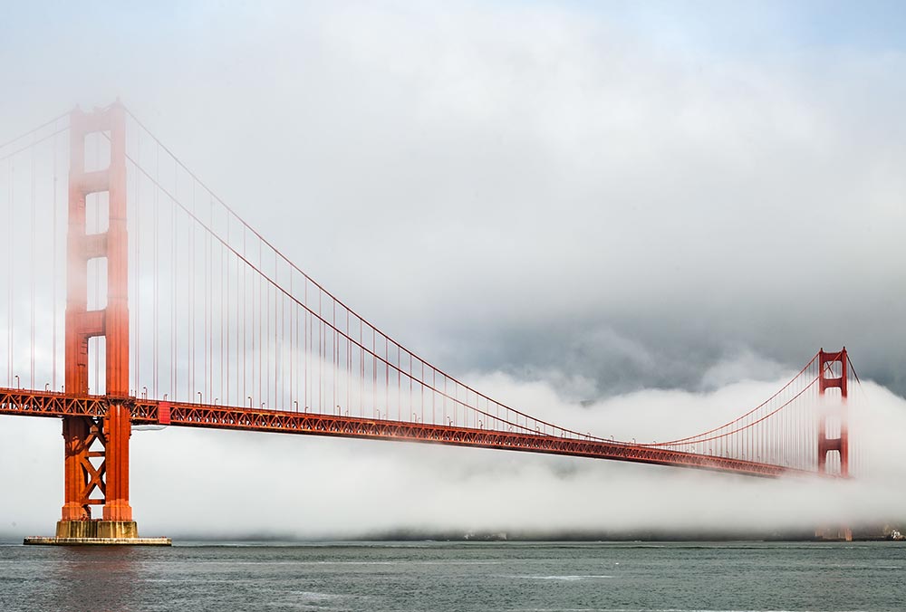
Anyway, what the Internet Archive does is, in fact, impossible. The internet is massive and constantly changing. Any attempt to collect a complete picture of it, like completely repainting the Golden Gate bridge, is not possible at any one time. However, a partial picture is still massively valuable. Brewster Kahle describes what he imagines like this:
Continues in class . . .
He tracked down a real estate listing on Funston Street in the outer Richmond and went to visit. The defunct Christian Science church made immediate sense. Kahle describes,
We bought this building because it matched our logo.
The Archive moved into a new home where it currently contains (at last count according to Wikipedia) over 20 million books, 3 million videos, 400,000 software programs, 7 million audio files, and 400 billion web pages. Webpages are collected and accessed through The Wayback Machine, which is a kind of Google-plus allowing a user to not only search a specific website *now* but also to access *previous* versions. It is an impossible and surely Sissyphian task, however The Internet Archive crawls the ever-changing world wide web making backups of the digital material it collects en route. Much of this data lives physically in the former church on custom-designed storage clusters called Petabox. This all reminds me of the story about painting the Golden Gate Bridge (the entrance to which is not far from The Internet Archive). Because the Golden Gate has such intense fog and weather, repainting the bridge is a continuous task. When a painting crew has reached the far side, they start again moving in the opposite direction. Painting the Golden Gate its distinctive International Orange is a never-ending job.
A quick Google search suggests that the story is true. Turns out it’s not.
Anyway, what the Internet Archive does is, in fact, impossible. The internet is massive and constantly changing. Any attempt to collect a complete picture of it, like completely repainting the Golden Gate bridge, is not possible at any one time. However, a partial picture is still massively valuable. Brewster Kahle describes what he imagines like this:
The idea was to try to build the Library of Alexandria, version two.The Library of Alexandria was burned and much of the written material of the ancient Mediterranean world was lost forever. The Internet Archive was conceived to avoid this fate and has more than 40 petabytes of digital data stored across redundant data centers on what amounts to simply a lot of hard drives.
Continues in class . . .
April 6, 2026
When It Changed
Reading
When It Changed, Part 1 (David Reinfurt)
When It Changed, Part 2 (Eric Li)
When It Changed, Part 3 (David Reinfurt & Eric Li)
Resources
When It Changed (Are.na channel)
Visitor
Eric Li
Assignment
#3 w-w-w (continues)
When It Changed
Reading
When It Changed, Part 1 (David Reinfurt)
When It Changed, Part 2 (Eric Li)
When It Changed, Part 3 (David Reinfurt & Eric Li)
Resources
When It Changed (Are.na channel)
Visitor
Eric Li
Assignment
#3 w-w-w (continues)
It was 2018, just before the end of summer, and I was in Post Mills, Vermont paging through old copies of Vermont Life magazine. My wife’s mother and father, longtime state residents, have saved copies of the magazine from the last 50 years or so. It’s published quarterly, each issue taking advantage of Vermont’s four crisply rendered seasons. A story might detail the comings and goings in the town of Corinth around a furniture maker’s workshop at the start of fall, or the raising, in early spring, of a round barn in Bradford. Each story is particular, and somehow each is also generic.

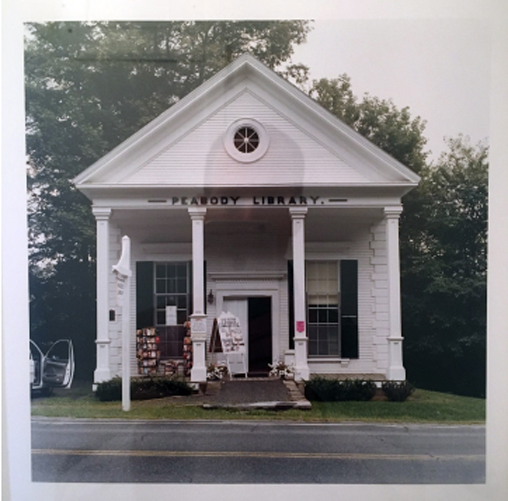
To read the magazine now in a small town in the state is like stepping into a time-shifted mirror. The towns of Vermont Life in 1968 look more or less like the current town of Post Mills. Like any one of the featured places, Post Mills is tiny (population 346) and picturesque. There’s an airport for small planes, gliders, and hot air balloons, a baseball diamond, a graveyard, a farmstand, a general store, and a small public library with a paperback lending rack on the porch. Corinth is 12 miles northwest, Bradford is 13 miles northeast, and in between is unblemished landscape.
I was flipping through the summer 1968 issue of Vermont Life when I was stopped by a small news item included on the last page. It read:
I recognized this future law as what would become the 1968 State Billboard Act (Title 10, Chapter 21, § 495). The statute prohibits the construction of all off-premise commercial signage in the state of Vermont and regulates the size and design of all commercial signage.
It’s an exceptional piece of legislation and a testament to the power of government regulation to attack problems that are too large or unwieldy to be solved another way. Visiting Vermont today, it’s visually striking to drive through a landscape untouched by commercial signs, or be in a public space without the clamor of so many advertising messages competing for your attention. The reclaiming of public space for the public in 1968, not to mention still, 50 years later, seems an impossibly optimistic action, usefully out of step with what has become the defacto trade of advertising for access that fuels our collective notions of public space in the United States today.
Continues in class ...
To read the magazine now in a small town in the state is like stepping into a time-shifted mirror. The towns of Vermont Life in 1968 look more or less like the current town of Post Mills. Like any one of the featured places, Post Mills is tiny (population 346) and picturesque. There’s an airport for small planes, gliders, and hot air balloons, a baseball diamond, a graveyard, a farmstand, a general store, and a small public library with a paperback lending rack on the porch. Corinth is 12 miles northwest, Bradford is 13 miles northeast, and in between is unblemished landscape.
I was flipping through the summer 1968 issue of Vermont Life when I was stopped by a small news item included on the last page. It read:
In spite of such pessimism, and similar doubts expressed by Samuel Ogden (page 16), it is possible a shining triumph will have been enacted when these words reach the reader. We’re speaking of Theodore M. Riehle’s proposal to ban all Vermont billboards and signs. Only signs allowed would be standard, state-owned directional signs, and the owner’s on-premises signs. At this writing, in January, Mr. Riehle’s bill, impossible as it seemed at first, appeared to have a good chance of passage.The tone was surprising and compelling. It seemed to be both a report on what had happened as well as a rather self-assured prediction of what would be soon to happen: a shining triumph will have been enacted when these words reach the reader. Further, from my comfortable position in 2018, I knew the prediction was correct.
I recognized this future law as what would become the 1968 State Billboard Act (Title 10, Chapter 21, § 495). The statute prohibits the construction of all off-premise commercial signage in the state of Vermont and regulates the size and design of all commercial signage.
It’s an exceptional piece of legislation and a testament to the power of government regulation to attack problems that are too large or unwieldy to be solved another way. Visiting Vermont today, it’s visually striking to drive through a landscape untouched by commercial signs, or be in a public space without the clamor of so many advertising messages competing for your attention. The reclaiming of public space for the public in 1968, not to mention still, 50 years later, seems an impossibly optimistic action, usefully out of step with what has become the defacto trade of advertising for access that fuels our collective notions of public space in the United States today.
Continues in class ...
April 13, 2026
Like del.icio.us, but better
Reading
On Motivation
Resources
** How do you describe Are.na at a party?
The Last Days of Social Media
Web 2.0
Visitors
Charles Broskowski
Sean Yendrys
Assignment
#3 w-w-w (continues)
Like del.icio.us, but better
Reading
On Motivation
Resources
** How do you describe Are.na at a party?
The Last Days of Social Media
Web 2.0
Visitors
Charles Broskowski
Sean Yendrys
Assignment
#3 w-w-w (continues)
There’s a channel on Are.na called ** How do you describe Are.na at a party? Wonderfully self-reflexive, it’s also quite earnest. A few descriptions I particularly like include “an internet for introverts,” “playlists for ideas,” and “hyperlink society at its best.” One user declares it is “how i’d want to browse the internet forever,” and another offers a concrete description of its logo “two six point asterisks side by side, with two points of each asterisk touching in the middle”:

The logo itself (designed by Harsh Patel) does a remarkably concise job of describing how the platform works. In a linear text, the asterisk is used to mark a link to further information, pointing off in another direction from the thrust of the argument. (The graphic form of the asterisk even suggests its function.) Are.na is premised on these sideways connections. Users post “blocks” which are aggregated into “channels.” Any block can be connected to any number of channels. Channels can even include other channels. It’s an organic network built by its users.
Another way to describe Are.na which seems especially apt is “like del.icio.us, but better.” Ten years into Are.na’s existence as a slow, considered social network of sorts, co-founder Charles Broskowski wrote a blog post titled On Motivation about why to keep going. In it he points to precedents for Are.na including early social bookmarking website del.icio.us.
Founded in 2003, Del.icio.us was an early Web 2.0 site and fostered organic communities of interest as users shared their internet bookmarks. It ran on the assumption that if you appreciated (or shared) another user’s bookmarked website, you might also like that user’s other bookmarks. (Bookmarks seem largely antiquated on today’s internet.) You’ll notice that this logo (which seems to have been designed by the site’s co-founder) is built up of discrete blocks to form the whole. Again, it is a pretty concise description of how del.icio.us works.
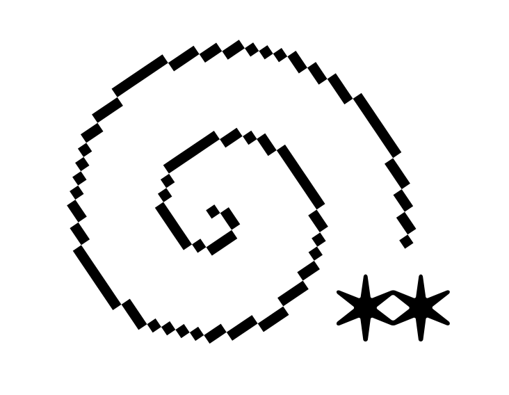
The Are.na blog post is, naturally enough, illustrated with Are.na blocks including this stunner by Bryce Wilner, called Plotter’s Tour (Spiral) (2017).
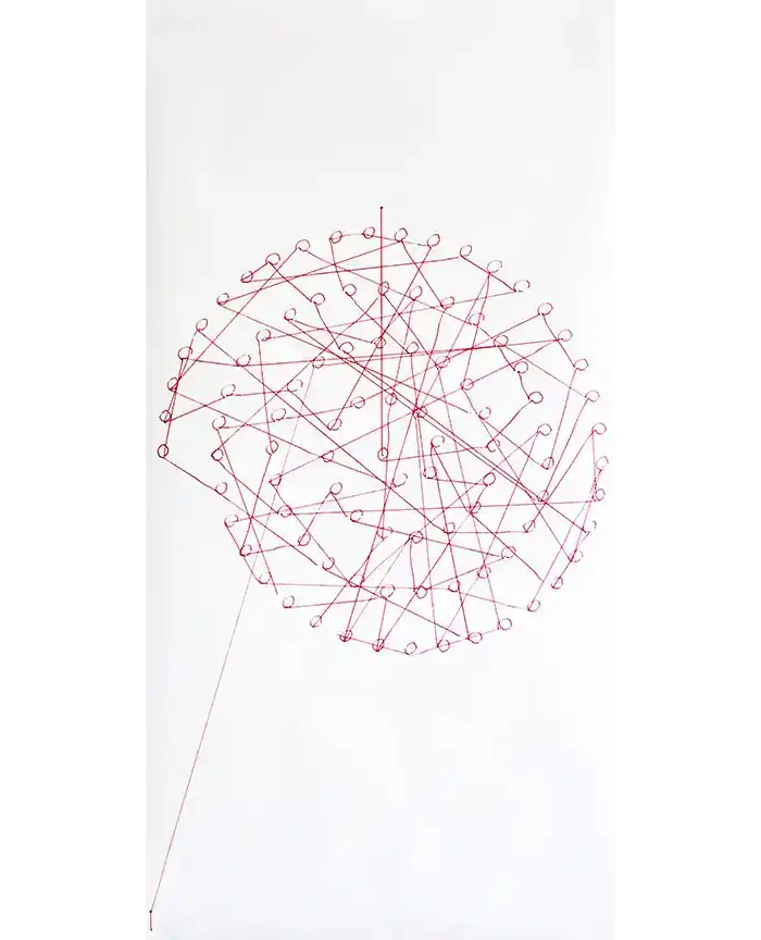
To my eyes, this is a perfectly convincing picture of the process of building up a whole by an incremental aggregation of connections. You will notice the lines look hand-drawn, but instead these are drawn by a computer-controlled pen plotter. You will also notice that the dots that form the spiral are connected, but not in a route following the curve. You will then notice the lines hop from dot to dot, connecting the parts in an ordered sequence which, only over time, reveals the big picture — in this case, a spiral. This is one in a sequence of works that Bryce describes in an interview with the Creative Independent.
Bryce’s Plotter’s Tour (Spiral) might work as an equally descriptive Are.na logo. Here, as on the platform, a dense and coherent network forms *only* through the process of making connections. Crucially, this picture only emerges over time, the result of a virtuous cycle captured in another Are.na block:

*Also* visiting today is Sean Yendrys from Tallinn, Estonia where he directs the MA Curriculum in Graphic Design at the Estonian Academy of Arts. Sean is an independent designer and makes exceptional and influential work. I don't think he is on are.na, but his work definitely is.
Continues in class . . .
The logo itself (designed by Harsh Patel) does a remarkably concise job of describing how the platform works. In a linear text, the asterisk is used to mark a link to further information, pointing off in another direction from the thrust of the argument. (The graphic form of the asterisk even suggests its function.) Are.na is premised on these sideways connections. Users post “blocks” which are aggregated into “channels.” Any block can be connected to any number of channels. Channels can even include other channels. It’s an organic network built by its users.
Another way to describe Are.na which seems especially apt is “like del.icio.us, but better.” Ten years into Are.na’s existence as a slow, considered social network of sorts, co-founder Charles Broskowski wrote a blog post titled On Motivation about why to keep going. In it he points to precedents for Are.na including early social bookmarking website del.icio.us.
Founded in 2003, Del.icio.us was an early Web 2.0 site and fostered organic communities of interest as users shared their internet bookmarks. It ran on the assumption that if you appreciated (or shared) another user’s bookmarked website, you might also like that user’s other bookmarks. (Bookmarks seem largely antiquated on today’s internet.) You’ll notice that this logo (which seems to have been designed by the site’s co-founder) is built up of discrete blocks to form the whole. Again, it is a pretty concise description of how del.icio.us works.
The Are.na blog post is, naturally enough, illustrated with Are.na blocks including this stunner by Bryce Wilner, called Plotter’s Tour (Spiral) (2017).
To my eyes, this is a perfectly convincing picture of the process of building up a whole by an incremental aggregation of connections. You will notice the lines look hand-drawn, but instead these are drawn by a computer-controlled pen plotter. You will also notice that the dots that form the spiral are connected, but not in a route following the curve. You will then notice the lines hop from dot to dot, connecting the parts in an ordered sequence which, only over time, reveals the big picture — in this case, a spiral. This is one in a sequence of works that Bryce describes in an interview with the Creative Independent.
Bryce’s Plotter’s Tour (Spiral) might work as an equally descriptive Are.na logo. Here, as on the platform, a dense and coherent network forms *only* through the process of making connections. Crucially, this picture only emerges over time, the result of a virtuous cycle captured in another Are.na block:
*Also* visiting today is Sean Yendrys from Tallinn, Estonia where he directs the MA Curriculum in Graphic Design at the Estonian Academy of Arts. Sean is an independent designer and makes exceptional and influential work. I don't think he is on are.na, but his work definitely is.
Continues in class . . .
April 20, 2026
A realistic day in my life living in New York City
Reading
An Interview with Maya Man
Resources
Maya Man: A Realistic Day In My Life Living In New York City
I'm always thinking about the Internet
HEART
Visitor
Maya Man
Assignment
#3 w-w-w (continues)
A realistic day in my life living in New York City
Reading
An Interview with Maya Man
Resources
Maya Man: A Realistic Day In My Life Living In New York City
I'm always thinking about the Internet
HEART
Visitor
Maya Man
Assignment
#3 w-w-w (continues)
Artist Maya Man’s website has sparkles:

It also has links, lots of links, starting with a directory of where to find Maya on the internet, platforms including TikTok, Instagram, Twitter, and Are.na. That’s followed by a list of ”links! click around” which points to her projects elsewhere online. Next a collection of websites, talks, writing, and press. Oh, also a bio, a cv, and a photo. All collected on one simple html webpage. I like it!
So let’s follow Maya's lead and “click around.” The first link I clicked on just now is a winner — ☆ tiktok.mov (I made this in 2010 lmao). It’s hilarious, yes, and definitely cute. But despite the video’s title, it was made seven years before TikTok. So watching now, the video reads a bit differently than it must have when it was posted. Absolutely nothing in the work has changed, except crucially its context, and so then also its meaning. Maya’s work lives online, and it must come to terms with this situation. The internet, and to a lesser extent the world wide web, lives in a state of constant change. It will be different right *now* than when what it will be by the end of this sentence. Making work designed to live in the quantum foam of the internet, where every possibility is possibly possible, can’t be easy.
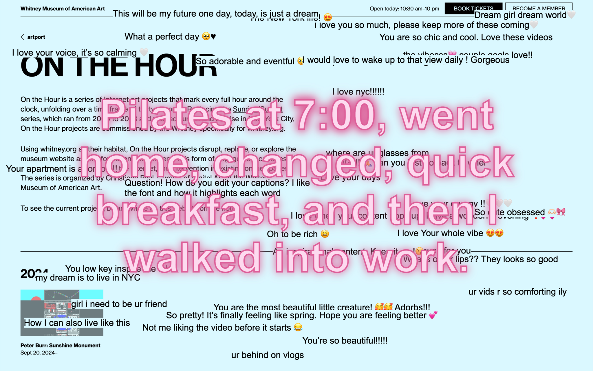
A more recent project addresses its context concretely. A Realistic Day In My Life Living In New York City is a project commissioned by the Whitney Museum of American Art as part of its On the Hour series. Maya’s project was hosted on whitney.org for one year where at the turn of every hour, the site dimmed and Maya’s project appeared on top. The project’s source material is scraped from TikTok, graphically repurposed and reformatted for the Whitney website, referencing a specific hour which matched the current one, and collecting accounts of daily life in the place where the museum and the artist live, New York City. So this is an artwork that’s place-specific, time-specific, (web)site-specific, and medium-specific. I am going to include the full project description here:
Continues in class ...
It also has links, lots of links, starting with a directory of where to find Maya on the internet, platforms including TikTok, Instagram, Twitter, and Are.na. That’s followed by a list of ”links! click around” which points to her projects elsewhere online. Next a collection of websites, talks, writing, and press. Oh, also a bio, a cv, and a photo. All collected on one simple html webpage. I like it!
So let’s follow Maya's lead and “click around.” The first link I clicked on just now is a winner — ☆ tiktok.mov (I made this in 2010 lmao). It’s hilarious, yes, and definitely cute. But despite the video’s title, it was made seven years before TikTok. So watching now, the video reads a bit differently than it must have when it was posted. Absolutely nothing in the work has changed, except crucially its context, and so then also its meaning. Maya’s work lives online, and it must come to terms with this situation. The internet, and to a lesser extent the world wide web, lives in a state of constant change. It will be different right *now* than when what it will be by the end of this sentence. Making work designed to live in the quantum foam of the internet, where every possibility is possibly possible, can’t be easy.
A more recent project addresses its context concretely. A Realistic Day In My Life Living In New York City is a project commissioned by the Whitney Museum of American Art as part of its On the Hour series. Maya’s project was hosted on whitney.org for one year where at the turn of every hour, the site dimmed and Maya’s project appeared on top. The project’s source material is scraped from TikTok, graphically repurposed and reformatted for the Whitney website, referencing a specific hour which matched the current one, and collecting accounts of daily life in the place where the museum and the artist live, New York City. So this is an artwork that’s place-specific, time-specific, (web)site-specific, and medium-specific. I am going to include the full project description here:
A Realistic Day In My Life Living In New York City builds on one of the most popular formats for short-form content on the Internet, the “day in my life” video, to explore online self-representation. The artist excerpted text mentioning specific hours of the day—for example 8 am, 11 pm—from thousands of publicly posted TikTok videos, stripping them of all visual elements to highlight the “day in my life” genre’s method of storytelling. At the top of every hour, a quote from a “day in my life in New York City” video referencing the specific hour appears in large font size on whitney.org, followed by a stream of animated responses from the source videos’ comment section. Producers of “day in my life” content commonly use the descriptor “realistic” in the title of their videos, striving to communicate an aura of authenticity and relatability on social media platforms cluttered with overt product placement and aspirational lifestyle content. Man’s piece highlights the blurring of lines between living and performance in a format that offers a template for turning every moment into cinema and every person into a star. The “day in my life” genre requires a dramatized performance of the respective creator’s day while capitalizing on every TikTok scroller’s voyeuristic desires. A Realistic Day In My Life Living In New York City invites its audience to consider both the sincerity and absurdity of this contemporary form of content production.Maya Man will join us today and we can ask her for more information.
Continues in class ...
April 27, 2026
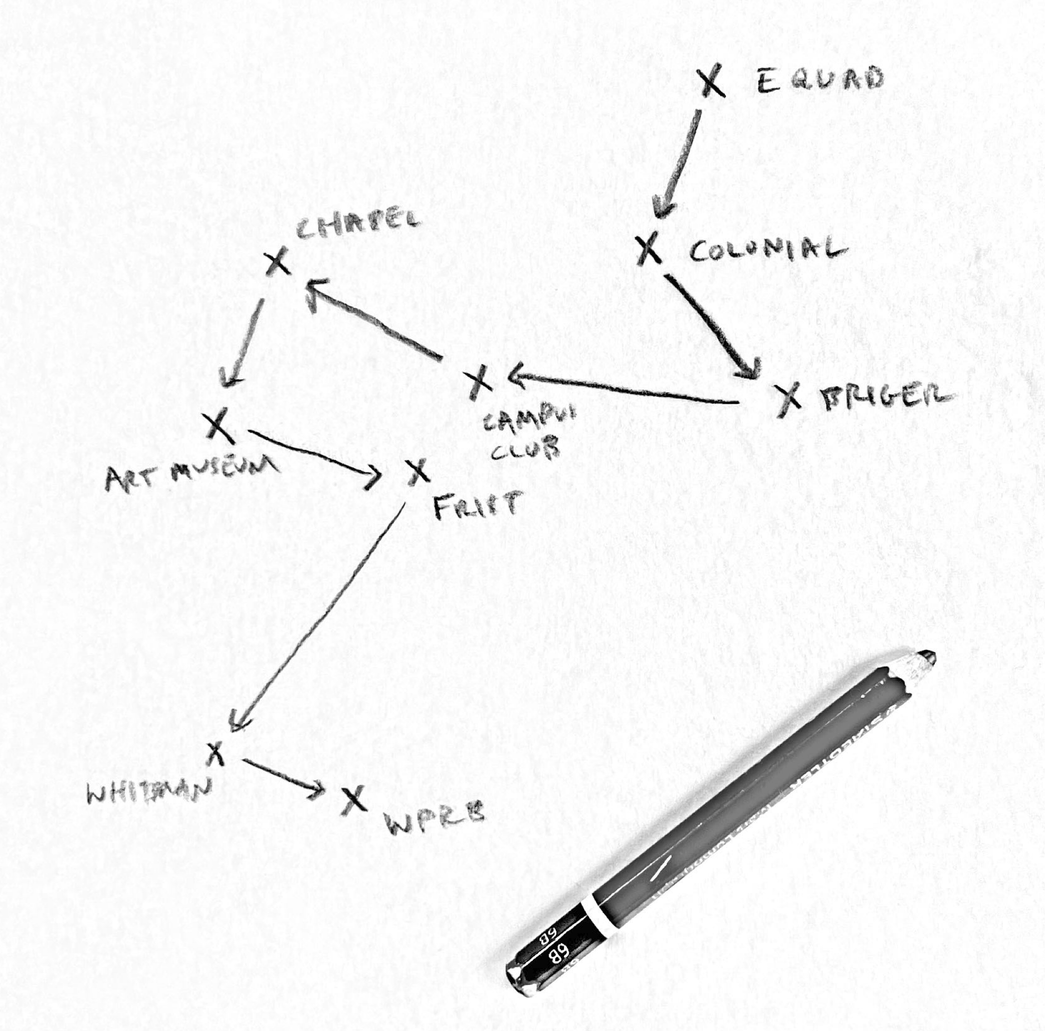
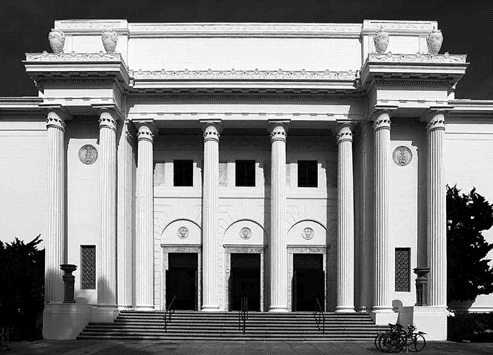
Final review (a walk around campus)
Resources
Are.na
Assignment
#3 w-w-w (ends)
Student work
David Jacob Blankson-Hemans
Roland Bonaparte
Yoselin Chavez
Jenny Fan
Josh Greer
Joshua Jen
Sergei Kudriavtcev
Kevin Le
Claudia Lee
Riley Samples
Jessica Ugwoke
Final review (a walk around campus)
Resources
Are.na
Assignment
#3 w-w-w (ends)
Student work
David Jacob Blankson-Hemans
Roland Bonaparte
Yoselin Chavez
Jenny Fan
Josh Greer
Joshua Jen
Sergei Kudriavtcev
Kevin Le
Claudia Lee
Riley Samples
Jessica Ugwoke
I hope that our final review will take the form of a walk around campus, reviewing your websites as we travel between the places they address. Let’s see where we end up.