The first Metrocard Vending Machines were installed in New York City subway stations in January, 1999. Here’s one being shoehorned into 68th Street station, Manhattan:
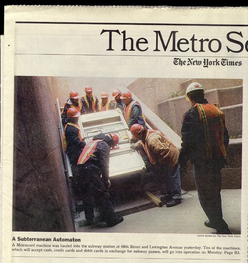
Tomorrow, December 31, 2025, the last machine will have been removed and replaced with an all-new OMNY tap system. Over the 25+ years of service to billions of users, the graphic touchscreen interface has remained fundamentally unchanged from what I designed in 1997. That is a virtual eternity in the world of software.
This is a case study of that interface designed almost 30 years ago and was still in use today, fundamentally unchanged. This is a project I worked on, so it will have some personal detail.
We begin in 1995. I had just started working at IDEO San Francisco for Bill Moggridge. IDEO was a product design firm, but around that time they’d moved into the new practice of interaction design. I’d worked for a couple years in New York, and had heard about what was going on at IDEO. It sounded exciting and I managed to get a job there as an interaction designer. I moved to California. (Turns out, I was hired by Gitta Solomon who had come to IDEO from Apple Advanced Technology Group which we looked at in a previous class.)
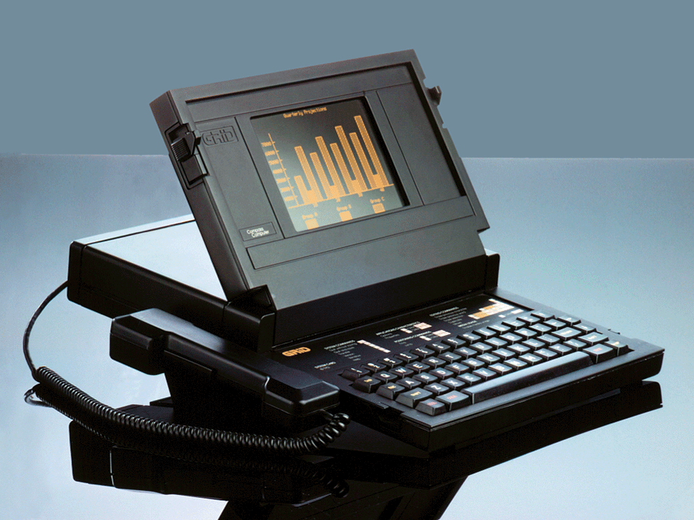
Twelve years before in 1983, Moggridge designed this laptop computer, the Grid Compass. Laptops were novel and, as I understand it, when Moggridge began to live with the machine he soon realized that the bulk of his attention was focused on the screen. The physical design of the product was good, but the interface was where the action was. This epiphany at least in part led to developing interaction design at IDEO. By 1995, when I arrived, the discipline was established, if fairly new.
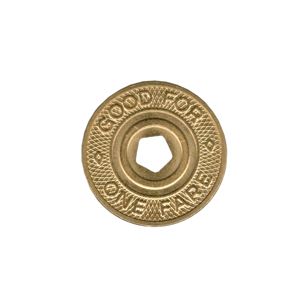
This is a New York City subway token, also from 1995. The token came from a clerk in a subway station where you walked up to the booth, stuffed your dollar under the window, and said, “One.” A token was returned and that token then put into a slot in a turnstile, which let you enter the subway. It was fast, could be a bit gruff, but it was also quite efficient.
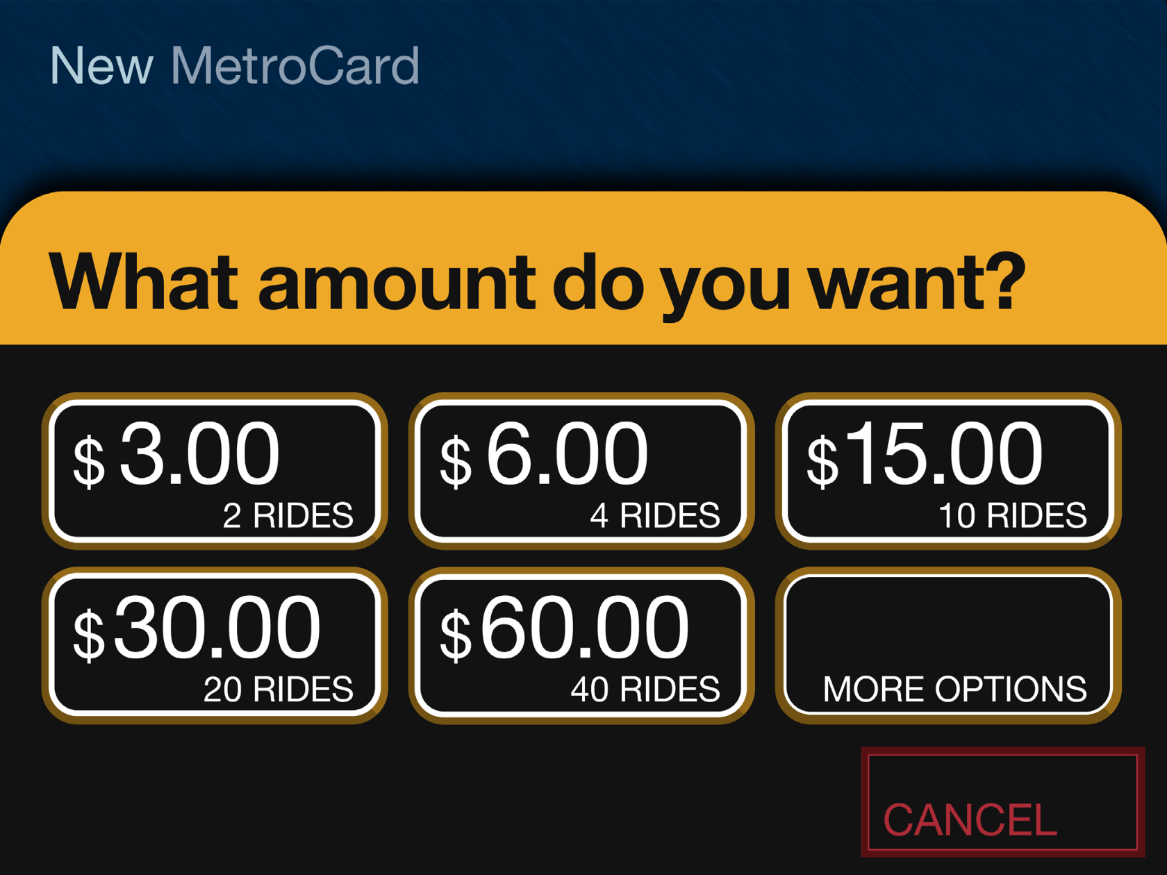
At the time, the MTA (Metropolitan Transit Authority) was moving away from tokens and would soon introduce the MetroCard, a magnetic swipe stored value system, for fare payment. The MetroCard uses card readers built into turnstiles to validate transactions. Although you could also buy your MetroCard from the token booth, the MTA would soon offer an electronic vending machine for purchasing a MetroCard via a touchscreen interface. The new machine would eventually make the token booth redundant. There’d still be a clerk there to manage questions and problems and hand out maps, but most of the cards were meant to be sold through the machine. The MTA had been working on this project for a while already, but the machine was delayed. The job was commissioned to Cubic Westinghouse, a defense and public transportation contractor based in San Diego who was already building turnstiles and station furniture for the MTA. You might imagine that Cubic Westinghouse didn’t have a great deal of experience, or design nuance anyway, for the electronic, user-facing aspects of this new machine which facilitates a rather complicated transaction.
Design for screens was also still relatively crude and computer interfaces were not ubiquitous in the way they are now. To get an idea of that context, Google was not even a thing.
Continues in class ...
Tomorrow, December 31, 2025, the last machine will have been removed and replaced with an all-new OMNY tap system. Over the 25+ years of service to billions of users, the graphic touchscreen interface has remained fundamentally unchanged from what I designed in 1997. That is a virtual eternity in the world of software.
This is a case study of that interface designed almost 30 years ago and was still in use today, fundamentally unchanged. This is a project I worked on, so it will have some personal detail.
We begin in 1995. I had just started working at IDEO San Francisco for Bill Moggridge. IDEO was a product design firm, but around that time they’d moved into the new practice of interaction design. I’d worked for a couple years in New York, and had heard about what was going on at IDEO. It sounded exciting and I managed to get a job there as an interaction designer. I moved to California. (Turns out, I was hired by Gitta Solomon who had come to IDEO from Apple Advanced Technology Group which we looked at in a previous class.)
Twelve years before in 1983, Moggridge designed this laptop computer, the Grid Compass. Laptops were novel and, as I understand it, when Moggridge began to live with the machine he soon realized that the bulk of his attention was focused on the screen. The physical design of the product was good, but the interface was where the action was. This epiphany at least in part led to developing interaction design at IDEO. By 1995, when I arrived, the discipline was established, if fairly new.
This is a New York City subway token, also from 1995. The token came from a clerk in a subway station where you walked up to the booth, stuffed your dollar under the window, and said, “One.” A token was returned and that token then put into a slot in a turnstile, which let you enter the subway. It was fast, could be a bit gruff, but it was also quite efficient.
At the time, the MTA (Metropolitan Transit Authority) was moving away from tokens and would soon introduce the MetroCard, a magnetic swipe stored value system, for fare payment. The MetroCard uses card readers built into turnstiles to validate transactions. Although you could also buy your MetroCard from the token booth, the MTA would soon offer an electronic vending machine for purchasing a MetroCard via a touchscreen interface. The new machine would eventually make the token booth redundant. There’d still be a clerk there to manage questions and problems and hand out maps, but most of the cards were meant to be sold through the machine. The MTA had been working on this project for a while already, but the machine was delayed. The job was commissioned to Cubic Westinghouse, a defense and public transportation contractor based in San Diego who was already building turnstiles and station furniture for the MTA. You might imagine that Cubic Westinghouse didn’t have a great deal of experience, or design nuance anyway, for the electronic, user-facing aspects of this new machine which facilitates a rather complicated transaction.
Design for screens was also still relatively crude and computer interfaces were not ubiquitous in the way they are now. To get an idea of that context, Google was not even a thing.
Continues in class ...
March 23, 2026
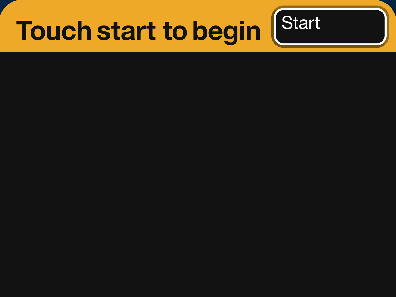
Touch start to begin
Reading
my website is a shifting house next to a river of knowledge. what could yours be? (Laurel Schwulst)
Resources
W3 Schools Javascript Tutorial
The-Interface-Experience.pdf (Kimon Keramidas)
Antenna Design
The Interface Experience
Talk to Me, MoMA
Art That Begs to be Touched (New York Times)
Assignment
#3 w-w-w (continues)